Wednesday, April 18, 2012

Can an 11th century Bayeux hang in a modern world?


I'm not sure where inspiration comes from ultimately but I do know that one day last year there seemed to be the most unlikely answer for several design projects we were working on concurrently.

It is a long story of how we got there so.......
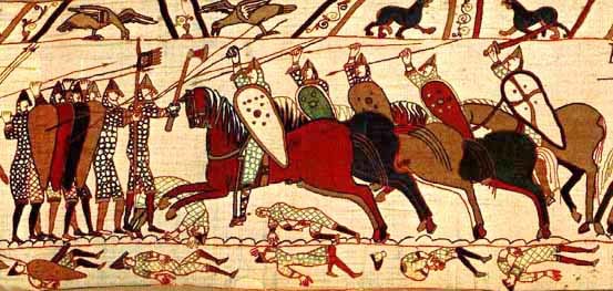
Let's just jump to the middle of the story where  I recall thinking immediately oh well that reminds me of the Norman invasion of England.  And when you think of the Norman invasion of England - we all know you can't see anything but the Bayeux tapestry!


I've always loved the Bayeux tapestry but I never really studied it in detail until recently!  Though the true origin of the tapestry is lost to history - it is thought that the Tapestry was made to celebrate William of Normandy's conquest of England.  These events culminated at the battle of Hastings where Harold, the current King of England, was killed.  Heady stuff right?

After months of obsessive study - I can say without equivocation that it is a true master piece of art and design.  It seems to me as fresh and relevant today as the day it was made. (thanks to my hip 21st century mentality!)

The stitching is effortless and a it amazes me how a  few carefully chosen colors and lines convey such a HUGE amount of gesture and motion.  Hats off you embroidery artists of olde.  I thought I had embraced a medium of restrained production but really letterpress and carving blocks is jet age stuff compared to hand embroidering a 206 ft long tapestry!!!!

You can see the whole thing at this crazy site which might have been designed shortly after the tapestry was finished - and flashing gifs invented - http://hastings1066.com/

Anyhow the more I thought about the Norman conquest of England the more I thought how much of the world can be summed up by that continual process of surging tides that rush around the world era after era.

Some for good and some for bad and some for the sake of overwhelming the old with the new.

And as you probably know by now we here at the Isle like a good theme to keep everything tidy as we hop from world to world in our design campaign - conversion - metaphor machination!

So I present without further adieu our song to the soul of the Bayeux tapestry - expect more of this in the future my friends!

your Friendly neighborhood conqueror
 Hiram the Great


Thursday, March 1, 2012

Stuff for When People Get happy

Some think romance is romantic but we here at Isle of Printing know the truth.

LETTERPRESS is the TRUE reflection of love!

Just like love - letterpress leaves and impression, can be beautiful, and can be messy or painful if you don't know what you are doing......

Every year we are fortunate enough to help guide many a happy couple through the perilous rapids of bad wedding design into the safe calm eddies of balance and harmony.  It is a personal journey and we feel protective of that experience for our clients.  The truth is it is a personal experience for us too!  Most jobs we do at IOP are fully custom - so our sweat and blood go out in every card.  Why? because we believe that if you are going to make something it should be worthy of taking up valuable space on our increasingly overcrowded planet!

However if you like mediocre design - you're in luck too - the paperless society is a perfect solution!  Just send an email so the poor soul receiving it can delete it as soon as possible.

but I digress.....

After a full year of pumping out the wedding jams for people who I'd like to think are our friends and family now  - we thought we would share them with the wider world


This invitation is a 5-color ode to the tree of life,  circle of life and love.  With a perforated rsvp at the bottom -  it folded up into a self mailer to save real trees from the paper mill.  After all you can't love trees in design if you don't love them for real!  We are very excited to have been involved!


Meg and William's invitation was commissioned by William and his parents after many years as fans of our art prints! We wanted to illustrate the good times the wedding party would be having at their Texas rehearsal dinner and give a bit of western feel.  So the family brought us pictures of the event space and we hand drew the night time scene and then hand-carved the blocks for the barn illustration below.  Once again this is a tri-fold self mailer with a detachable rsvp card.  

Afterwards, we carved MORE blocks for a full-sized print of the barn party!  Which is now framed at the newly weds house!!!


When Ben and Tara came to us to help them with their wedding and save the date cards - we really wanted to do something unique!  Ben owns a handcrafted drink emporium - so we thought it fitting to incorporate the high art of toasting into the save the date cards.  And since we are always trying to give our products a second life and keep them out of the bin - I suggested we make the save date info into drink coasters.   It was also our humble hope that every time their friends had a drink they would raise a glass to the future of the friends...and remember to save the date!

We sourced coaster paper to make them legit and used some of our favorite flourishes from the 19th Century design world to accent the wood type.  After we handprinted them on our press we then die-cut them into actual coasters to pop out and use!


For the invitation we revived another popular design element from the late 1800's.   It consists of a border set that a letterpress printer could put together much like legos to create endless permutations of designs from a few simple shapes.   Here we used it to create a graceful and unique border for the invitation that would compliment the spirit of the event - without becoming too fussy. This invite was printed deeply on all cotton stock one by one, then folded with an embossed envelope and letter pressed belly band.  Classy - just like Ben and Tara!


Mandee and Wes wanted an unpretentious wedding invitation that celebrated a love of nature and represented the venue over in the hills of East Tenn.  We found a beautiful woodcut frame in our collection and a funny border off an old ham bag that fit the bill perfectly!  The cuts are rustic, but the invitations retain a sense of simple elegance through the choice of silver ink on a creamy heavy stock paper.


This invitation is full of ornaments and filigree, but what really sends it home is the custom illustration of the wedding location: Nashville's Shelby Street Pedestrian Bridge.  We all liked the idea that a detachable portrait of the Bridge would be a really nice way to remember the day and be something the guests and family could hold onto long after the wedding had come and gone.


We love to draw here at IOP, and we definitely love to illustrate mice!  Imagine our delight when our friends Mike and Rachel mentioned they liked the idea of a mouse sized representation of the wedding weekend's events!!!!!   Happy days!  Thanks for letting us create this completely hand-drawn invitation of tiny mice doing the things that people do at weddings on the coast of California.....etched into two magnesium plates and then run in two colors by hand on cream stock.   Another trifold self mailer - cause mice need some air!


Trains, trains, trains! Can't go a day in our neighborhood without hearing a train go by. These fine folks decided to tie the knot at the old Houston Station down the street (also near the tracks).  Thus we made them a locomotive to deliver the details to their friends and loved ones with a few details of the historic water tower. Choo choo!


All our clients are hip and on the move come wedding day it seems!


Here's another completely hand-drawn wedding invitation featuring mice, partying hearty on the Music City Queen! Even though this one was only a one-color job, you definitely can't call it "plain!"


That's all for now, folks! Remember, tons of people get hitched every day, but only the genetically superior have their invitations letterpressed, and the best of those folks have them done at Isle of Printing!

love- Gal Friday Rothenhöfer
and your old pal Hiram Kneesch



Friday, November 4, 2011

Stamping out your blues


We have been playing around a bit with our new space technology this week. Like magic we produced our first official production stamp for a friend. Pretty neat. More on stamps soon - contact us for custom work.

your faithful servant

B McC

Wednesday, November 2, 2011

from the recent past


We are attempting to catch the digital lifestyle of electro sports monthly up with the real clock on the wall of life - hope you enjoy our trip down near memory lane.....

This print was commissioned as an original piece of art for the world premier of "HIlos" by the Latin grammy winner and Guggenhiem Fellow Gabriela Lena Frank.

Performed for the first time by Alias, the acclaimed chamber music ensemble from Nashville, Friday Oct. 1, 2010 to general acclaim and then released as a recording you can also hear via cd. What a night!

We were very excited to be involved in creating the visual representation of the music. It was a pleasure and as such I hope the art work shows that joy. This is just the sort of meeting of the minds I feel is very important to the arts and culture in general. Many thanks to Jennifer Lena and Jonathan Neufeld for making it happen.

When viewed together these prints form one of the larger pieces we have done as a multiple series to date. I like them separately as well.

19"x26" each. Approximately 38"x26" together
smoke - 3 colors
jug - 4 colors
printed on cream stock

Spirit - MTN is a reduction print, which means the blocks were carved down after each successive color was printed, so once they're gone, they're gone for good!

available now on etsy and in the shop!
print run of less than 50
signed and numbered

thanks for looking!

B. McCloud for H. Kneesch - curator to the jet stream set

Monday, October 31, 2011

Trick or treat!


Hello friends – Did you know that today the 7 billionth overly-designed word poster was posted on Etsy and then linked on pinterest?

Even though some of us can barely use the computer here at Isle of Printing – almost every night as we creep into bed - the image of today’s litter of “stay calm and do what your mama told you when you were little” spill uselessly out of our eyes and onto our pillows like little tiny typographic tears…..

Nay – It isn’t that we dislike language, type, or your friend’s designs…

We LOVE letters - and all the things they help us do. We LOVE printing and we LOVE posters.

We especially love that many fine people out there will support the folks that get up every afternoon and knock out a few prints for the fine citizens of the world-wide-craft market to enjoy.

Honest!

Yes it was a nice ride and we all enjoyed the scenery – and we have lots of posters to remind us how and what we were doing or not doing or thinking about doing – in all sorts of typefaces and printing methods and from every corner of creation.

And now I can say that I don’t know about you but I am ready for my prints to quit telling me what to think all the dang time on really nice paper.

Soooooooo

If you seek the honest and are sick of precious buy a poster and tell the world in a slightly snarky way! Fill that hole in the wall of your heart with our love. WE LOVE YOU!!!!!!!!!!
Poster measures 9"x12"

One-color letterpress print
edition of 100

ACTUALLY ON ARCHIVAL PAPER! This print is going to be around forever! And you saw it here first!!!!!!!

find it on ettttt-sy
or our very own
website

Xxoo
Hiram Kneesch

Wednesday, October 5, 2011

a step in another direction

Hey there space fans!

Lately
I've been thinking about this space, which we have generated surreptitiously to fill in with our dawdling thoughts, as a more important aspect of our doings than I might have originally given it credit.

Making things is complicated.  But surely an important aspect of making things is the thinking that goes into the making.  

We have spoken about things we are creating and things you might consider buying to help us continue to make things, but I don't believe we have really given much air to the ideas beyond the objects made.

Which is to say....
Art is importantly connect to life and living - and as such life guides the art into being.

I am always awed when I see things made for such pure reasons as to fashion a personal vision into being.  Serving the makers first but in the purity of the making bettering us all.

A simple concept that is a very hard trail to follow through life.

Is art the act of living well?

Here is a video which rang true to me.

Living In A Geodesic Dome Home

Tuesday, September 27, 2011

The Journey of a Linocut

We've been working hard here at the Isle, and we've got the goods to prove it!

This is our most recent poster, inspired by our love for cargo bicycles and retro advertising. To the untrained eye, this poster may look amazing. In reality, it's really freaking amazing (I can say this because I didn't carve it, Bryce did), and here's the reason why: the awesome carving process.

What starts as a twinkle in our eyes becomes a sketch, which then becomes a graphite transfer, which is applied to a block of linoleum. The linoleum is then carved and sculpted into one layer, starting with the background. Out of context, one layer doesn't look like much–but once supporting layers are added, it becomes a work of art.

This particular poster was created using the reduction method of carving, where one block is used for multiple layers. In the end, the topmost layer is all that remains of the original cut. Every layer is given a different color, and some colors show through one another to add even more depth.

Here's a line-up of each step of this poster's process:

This poster is on sale in our shop right now, and will be available soon online. Stay tuned for more hand-printed goodness from your friends at I.O.P!

-Girl Friday Röthenhofer